Showing posts with label photoshop. Show all posts
Showing posts with label photoshop. Show all posts
Wednesday, August 04, 2010

Tuesday, August 03, 2010

Monday, July 26, 2010
The new TP
"The only reservation I have is I'm not so sure he doesn't train too much, It seems like he's there all day. He's just a worker..."
- Jim Tressel

Tuesday, July 20, 2010
Over scheduled
I don't need to tell anyone that visits here on a regular basis, but things have been a little slow. Not a lot of college football stuff to comment on and when you add in a real job that requires me to like.... work, and this place is becoming down right boring. I'd like to blame T9, but I know she has a job and a life also.
In an effort to fix, I decided to put together a schedule wallpaper. and then I had another idea. and another, until I clearly went overboard. Rather than choose just one, I thought I would share them all. Let me know which one you like the best.


In an effort to fix, I decided to put together a schedule wallpaper. and then I had another idea. and another, until I clearly went overboard. Rather than choose just one, I thought I would share them all. Let me know which one you like the best.
Will Campbell

Darryl Stonum

Michael Shaw

Denard Robinson

Tate Forcier

Roy Roundtree & friends

Monday, July 12, 2010
NCAA Football 11
 Tonight at midnight, EA sports releases their latest and greatest version of the popular college football game, NCAA 11. My son has already pre-ordered his copy and I am sure he will be up earlier than he has been all summer to pick it up at BestBuy. By noon, he should have his first National Championship under his belt.
If you have not bought the game in the past couple of years, reports from the gaming community say this might be the year you need to get the new game. Improvements in the transitions, the addition of QB vision cone and player locomotion will be interesting. And yes, they have updated Michigan Stadium to include the new press box/suite structure.
The biggest issue for me at this point is the inclusion of Denver Bronco kick-returner Tim Tebow on the cover. Don't worry, there are plenty of custom covers available to replace the future NFL bust.
Custom Cover genius BIGDMO has a great collection, including Tate Forcier in all game consoles.

Denard Robinson is also available in a couple of different versions, one from cazihead and another from Spartyon6686.
 Full resolution |  Full resolution |
And for those of you looking for an "old school" touch, veteran cover maker easportsfan1 made this Tom Brady version for PS3.

and finally, I created a Brandon Graham version this morning.

You can download my full version here.
Go Blue.
Saturday, July 10, 2010
Magic act
"I PERSONALLY GUARANTEE THAT THE CLEVELAND CAVALIERS WILL WIN AN NBA CHAMPIONSHIP BEFORE THE SELF-TITLED FORMER ‘KING’ WINS ONE"
- Dan Gilbert. MSU '82

Couldn't get Izzo? Couldn't keep LeBron? I am pretty sure Magic is looking for a comeback venue.
- Dan Gilbert. MSU '82

Couldn't get Izzo? Couldn't keep LeBron? I am pretty sure Magic is looking for a comeback venue.
Sunday, June 20, 2010
CWS Day Two - Rain rain go away
We are in the middle of a 4 hour rain delay. Nothing to do but play around with photoshop. I just saw Oklahoma football coach Bob Stoops in the press box.


Monday, June 14, 2010


Tuesday, June 08, 2010

Monday, May 24, 2010

Thursday, April 29, 2010
Who let the cows out?
 I could not let T9's great buffet post go without a little photoshop magic, featuring my favorite buckeye.
 I strongly encourage you to go here and vote in the "Are you afraid of another cow attack?" poll. The current results show 51% (302 of 595) say YES. We need to swing the vote more in favor of "yes" to make the public more aware of the danger presented by these animals.
The REAL story not reported by the Buckeye news:
Last Wednesday two cows being transported to Ohio State’s Veterinary Hospital escaped and caused a chaotic two-hour round-up on the campus athletic fields next to Lincoln Tower.
OSU Police and university officials used at least seven police cars, a university tractor, a cattle prod and tranquilizers to corral the cattle. Head football coach Jim Tressel was called on the scene, but was unable to make a difference. The cows were being brought to the veterinary school to have their hooves trimmed, a regular procedure among some breeds of cows.
OSU veterinary staff didn’t have a long-range tranquilizer gun on hand, so they called officials at the Columbus Zoo, who sent an employee to tranquilize the second cow. Once the cow was tranquilized, police lassoed it and led it into a trailer.
After he was subdued, the cow was heard mumbling "Barwis" over and over.
You need to VOTE now !!!

Thursday, February 18, 2010
Gold Medal Fashion
 Once every four years the world gets the opportunity to watch curling. If you have never taken them time to watch, you are missing something. It may lack the speed and explosiveness of football, but it more than makes up for it with a laid back attitude, precision and intense strategy. For my money, there is no better sport in the world to sit down, relax and drink a lot of beer.
Quick lesson: Two teams of four players take turns sliding heavy, polished granite stone down a perfectly prepared sheet of ice towards a circular target (called the house). The goal is to complete each end (16 stones) closer to the center of the house. Two sweepers with brooms or brushes accompany each stone helping direct the stones to their resting place.
Typically you will see the curling teams uniformed in conservative attire. However, during these games the team from Norway decided to make a fashion statement. Instead of the normal black pants and patriotic shirt, they went with something a little louder. These pants from LoudMouthGolf.com have become one of the more interesting stories of the Vancouver Olympics and has been picked up from MSNBC to NPR.
 All this buzz about these pants led me to check out the other available patterns and colors.
 Warning, the LoudMouth web site is getting crushed right now because there was a feature story on the Today Show about the Norwegian Curling Team and their wacky pants -- but I got lucky and was able to locate a scarlet and grey pattern that I thought would look wonderful on the football fashion icon of the B11.
How awesome would it be to have Chesty McSweaterVest jog out onto the sidelines on September 2nd for the Bucks game against Marshall wearing these beauties ?
Friday, January 29, 2010
Preview
 The Spawn of MZone is very excited to get the opportunity to be the first to share the official 2010 MSU Football Media Guide with the world.
We obtained a preview image from one of our inside connections with the Sparty Athletic Department. After some quick negotiations, our insider graciously agreed to share the yet to be released cover on the condition anonymity.
As you may already know a media guide is program specific press kit, distributed as a book or binder. It typically features detailed information relating to the team's players, history, and statistics and in the case of Michigan State, the criminal records and prison terms for each and every player.
Friday, January 22, 2010
SEC Helmet Makeover
 As expected, last weeks B11 helmet make-over project generated a lot of opinions. It was by far the biggest visit generator since T9 launched this blog into the interwebs. Once the post was picked up by the popular UNIBLOGWATCH - the discussion on which designs were good and which designs sucked took place in several other places. It is pretty cool to watch something you created spawn all over the place.
I make no claim to be a credible graphics designer. I am just a guy with an internet connect, photoshop, a cool helmet template, and an obsessive personality. As the opinions flowed in, I decided to take a stab at our friends in the Southeastern Conference.
As I stated on the B11 project... the SEC has some great helmets and an actual change is ridiculous. This is simply a fun off season conversation starter -- and infinitely more enjoyable and productive than talking about recruiting. If you hate one or all of them, that is fine -- I will be happy to refund any money you paid to me to design these.
 | South Carolina: This one is easy. I have a soft spot in my heart for the Gamecocks because I met my wife in Columbia while she was a student at TheUSC. When Lou Holtz took over the program in 1999 he put them in the current fUGLY white helmets. Make the bad man stop. |
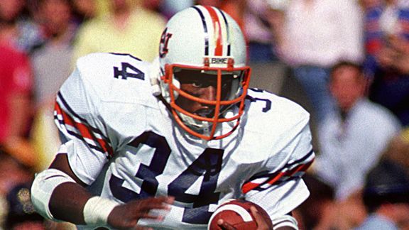
 | Auburn: The current with Auburn helmet, while not as bad as South Carolina's is still white and boring. Especially when you consider the existing alternate logos they have to work with. I went with the orange face-masks as a tribute to Bo Jackson. Without question, he is the best athlete I have ever seen in my life. |
 | Georgia: This is one of those cases where the existing design is perfectly fine, but in this project everyone has to participate. I know UGA wore something similar to this in 2009 against Florida. I considered using one of the many Bulldog logos they have, but knew I was going to use a one for Mississippi State, so I just stayed with the Packers "G". |
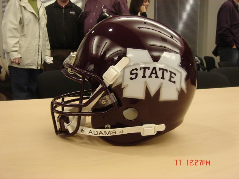
 | Mississippi State: I have never seen this particular Bulldog logo before I started this project. Not too bad. Certainly an improvement over the generic M with a state ribbon they use today. |
 | Mississippi: Working with a southern school that calls themselves the "Rebels" is a mine-field I would avoid in real life. I originally placed stars on a block M, but decided it looked too much like the stars and bars for my taste. Before the hate mail starts flowing in from Ole Miss fans... you are right, I don't understand. I never will. |
 | Arkansas: I think the running pig logo is so cool I wanted to keep it. I realize silver is not an official school color, but is an acceptable neutral color when you don't want to use black or white. Plus, anything I can do to throw off Ryan Mallett off his game is alright in my book. |
 | Kentucky: Yes, this one looks similar to the basketball schools in my B11 project. Their current alternate logo is far too busy, so I decided to come up with a whole new look. |
 | Vanderbilt: I was planning the standard star with a block V on a black helmet. Then I found this alternate Commodore logo and absolutely fell in love. This one is far and away my favorite in this make-over project. |
 | Tennessee: Because the Tennessee shade of orange is so much like sherbet, this could potentially look very humorous on TV. However, if it works for Florida, it should work for Tennessee. That being said, the UT logo with the state outline is much more distinctive than the current block T. |
 | Louisiana State: The current LSU design is a classic, but when they wore gold throw back helmets this year, and it also looked great. In addition, I tinkered with a purple version of this design, but decided I liked the gold model much better. |
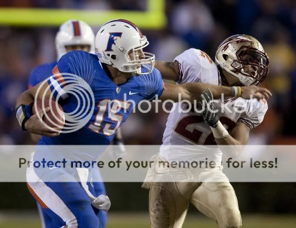
 | Florida: For years I have wondered why Florida does not use that fierce looking |
 | Alabama: This is the design I expect to generate the most response. Yes, I understand there is no reason to change the classic look of the Crimson Tide. This is just for fun. I really wanted to work in the elephant here, and I even tried a scary houndstooth design. But the traditional A looked best to me. |
I will restate this so my intention is clear: I DO NOT think that the teams from the SEC need to change their helmets. This is nothing more than an conceptual off-season conversation starter.
Which one do you like the best? Which one is the worst? What ideas do you have to improve any of the current or proposed helmets?
Tuesday, January 12, 2010
BigTeleven Makeover
 I don't need to tell anyone here that the image of the Big Ten has take a hit over the last couple of years. Historical failures in the Rose Bowl and recent memorable flops have added fuel to national discontent. Add in the generalized perception of over sized slow players, Ohio State losing two straight BCS games, Michigan falling into the college football abyss and the wild fire is blazing.
 The flash point for this happened in November 2006 when Michigan and Ohio State were both undefeated and ranked #1 and #2 in the polls. Following an epic (and painful for me) contest there was a lot of talk of a BCS title game rematch (I wanted nothing to do with a rematch). The SEC PR engine (cough, cough, CBS sports) started up hasn't slowed down since.
The recent conversations about adding a 12th team and a championship game got me thinking: What would a B11 makeover look like? I decided to start with the helmets. Rather than just choose a few, I decided to include everyone. I realize that in most cases, a change is ridiculous. But hey, we are in the off-season and content is hard to come by.
I know, I know... I have too much time on my hands. In any case, I would be interested in hearing which of these you like best, which one you think is the worst, and any additional concepts or ideas you may have.
 | Illinois: This one is the most simple and obvious needed change of the group. The hideous orange version the current Illinois helmet is embarrassing. I know the NCAA would have a problem with using the Native American imagery, but I don't care. I also don't think the non-existent Illini Indian tribe would either. |
 | Northwestern: I have nothing against the current Northwestern helmet, but this is a complete overhaul project and everyone needs to participate. I went through a couple of iterations of this before I just settled with the simple text design. The actual Wildcat logo is an amateurish drawing and did not work for me. |
 | Wisconsin: I am a big fan of the mascot paw track. Not many people know this, but Wisconsin actually uses a Badger Paw as a trademarked logo. I included the classic Wisconsin "W" to eliminate confusion on which school is wearing these helmets. |
 | Michigan State: Sparty changes their design a lot, but they have never used anything other than a green helmet (in the modern era). After attempting to design a black helmet and a silver helmet using a Spartan image, I settled on this white version. MSU uses the state of Michigan on their basketball court. |
 | Minnesota: Of all the helmets in this project, I think I like this Gopher one the best. In fact, I had to stop myself from using other cartoonish mascots for more schools because I loved this one so much and did not want to dilute its awesomeness. |
 | Purdue: The Boilermakers rolled out all black helmets for the 1989 and 1990 seasons, but for the most part they have always been a gold with the Purdue "P" team. The smoking train logo is way cool and should be used more. |
 | Indiana: Indiana is one of the more difficult teams in the B11 to work with graphically. There exists no Cornhusker like cartoon Hoosier and there really isn't an alternative to the standard interlocking IU logo. Quite honestly even that looks like the greek letter psi. So I just made something up using a block I and the state of Indiana. |
 | Iowa: I think the current Iowa Hawkeye logo is one of the best primary trademarks in the NCAA. As such, I saw no need or had no desire to change their outstanding and distinctive design. |
 | Penn State:This when I expect the rotten tomatoes to start flying. From what I can tell, the current simple white helmet is as important as Joe Paterno himself. I went with the equally bland blue helmet with numbers as they had from '68 to '74. |
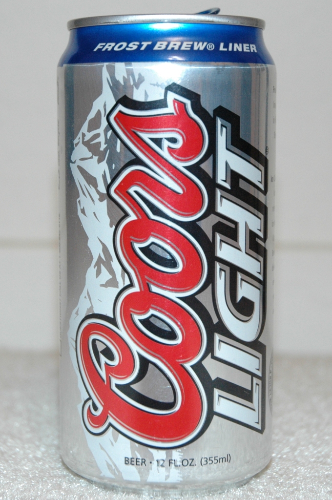
 | Ohio State: Before I start getting death threats over the loss of the Coors Light Silver Bullet design - you need to remember the Buckeyes wore scarlet helmets during 1966 and 1967 seasons coached by Woody Hayes himself. I resisted the temptation to put the cartoon version of Brutus and kept the chronic atta boy stickers. |
 | Michigan: I realize I am biased, but I think the existing Michigan helmet is a work of art. Attempting to make-over the winged helmet is like asking someone to augment the Mona Lisa. It just doesn't feel right. My first idea was to design a wolverine version of the USFL Michigan Panther helmet, but I couldn't get it right. So I just reversed the colors and turned my head away in shame. |
HT: Davidson at Chris Creamers Sports Logos Forum for the incredible helmet template.
1/14 edit: This post has generated a lot of interest (and hits). As you expect, everyone has their own opinion. Just so my intention is clear to anyone reading this -- This is nothing more than an conceptual off-season conversation starter. I DO NOT think that the teams from the B11 need to change their helmets (except Illinois). As a conference, we have some of the best helmet designs and color combos in the country. I was just playing around. If you don't like what I have done, fire up your computer and share your own ideas.
For my next project, I may do an SEC helmet makeover next just to see if I can piss them all off too.
Subscribe to:
Posts (Atom)


 Posts
Posts


 Visitors